Wondering why your theme’s device and browser responsiveness breaks with different resolutions? I had been for the last week or so. Tried many fixes. Potential fixes should I say. I discovered an error using a theme from the myThemeShop site, thought it was at fault, then reading up thought it was a google chrome fault (it may in part be…?) and when it worked on i.e. under some conditions and not chrome I was shocked! Whats going on? That would be the first time right?
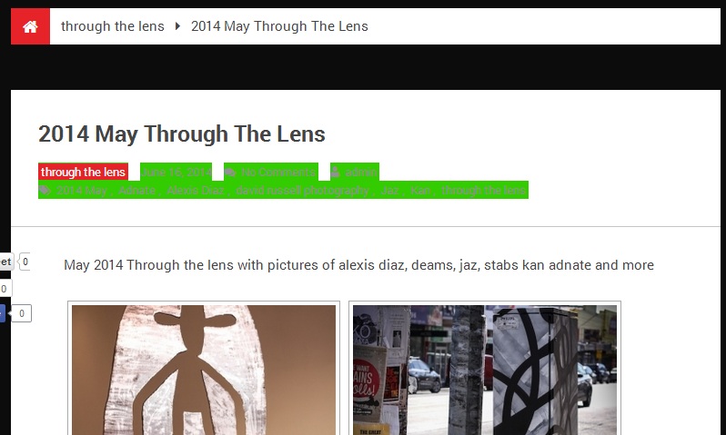
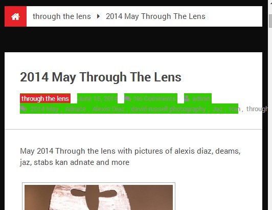
Upon resizing the post tags (highlighted in an awful green to demonstrate) were protruding out thgough the div; on iPhone this made the screen width twice as large as it should be!
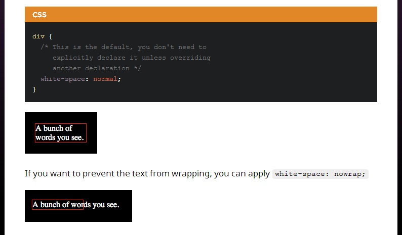
I discovered it had nothing to do with display:inline-block; position:absolute; @media queries, or word-wrap: break-word; After many attempts and combos and a few more sleeps, one coffee and some chris coyier css tricks gave me an idea. I tried css-ing a style that should already be in place, just in case it was being over-ridden. white-space:normal;