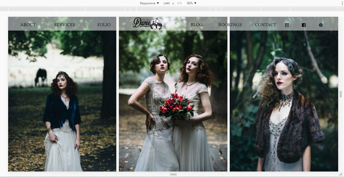
This was a request for the ***ADD LINK**** Distinctive Dame re-re-design project: to make the horizontal homepage slider show the centre of the image only on smaller devices; so the viewer doesnt just see a really small downsized version of the full size slider.

There are flexslider components in this ‘Fruity’ theme which I chose as the basis of the Dames website, but Slider control options are minimal so it had to be a hack or finding another slider – no more plugin hunts!!! – so I went for the hack option.

I tried text-align:center, align:center then read more and based on this stack overflow article: css centering slideshow images started thinking about percentages and comparative widths of container and the slides then I found articles like this transform and translate and css tricks center an object… then I tried on the 320px @media query for example:
@media only screen and (max-width : 320px)  {
#slider-container .container{width:640px !important;margin-left:-50%; !important;}
}
which results as hoped with: 
I added this css to every @media query from 768px down changing the width for each to double that of the query width. e.g.:
@media only screen and (max-width : 768px)  {
#slider-container .container{width:1536px !important;margin-left:-50%; !important;}
}

