Squarespace is a content management system used mainly by artists and creatives. It comes with a good selection of themes and is nicely responsive. Most features are styleable; If your theme doesnt give options for the styling you require- what are you going to do? Look for custom css of course. But what if you dont know anything about css?

Was asked to do a little web design for a company in Lower Templestowe – the challenge was to have boxes around the prices to make them stand out more. Simple right? Hmmm… ok er, no! Squarespace does not allow the user to do this, so here’s a little tutorial for you:
1. First, open chrome ‘inspect element’ f12
First, open chrome ‘inspect element’ f12and start looking for the div (container) surrounding the prices.
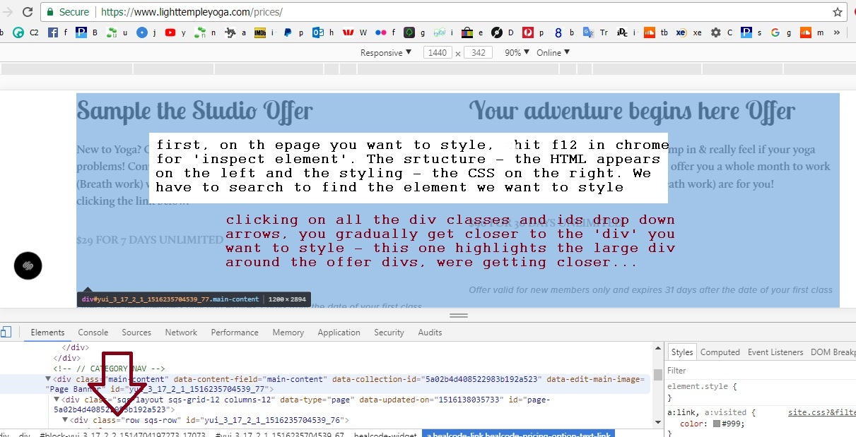
*ok so the tutorial would prove too much for her and probably anyone else with no web design hand coding experience, but it will be helpful for some of you i’m sure.
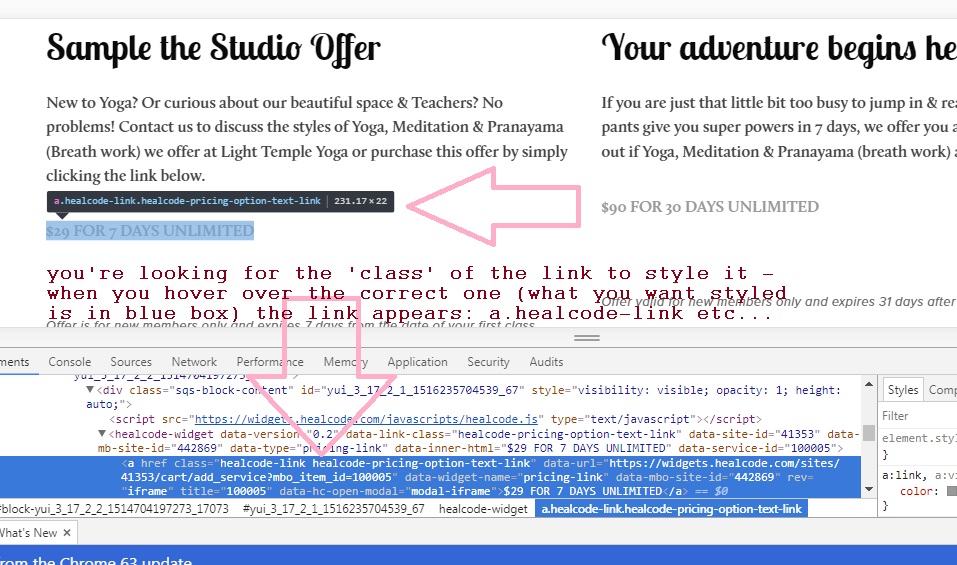
2. Searching for the element to style
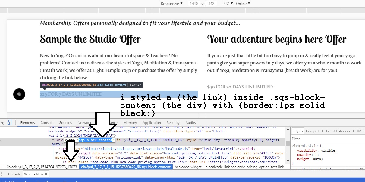
Searching through div ids and classes we find the a.healcode-link.healcode-pricing-option-text-link which when hovered over highlights in blue the price!
3. Squrespace Custom CSS
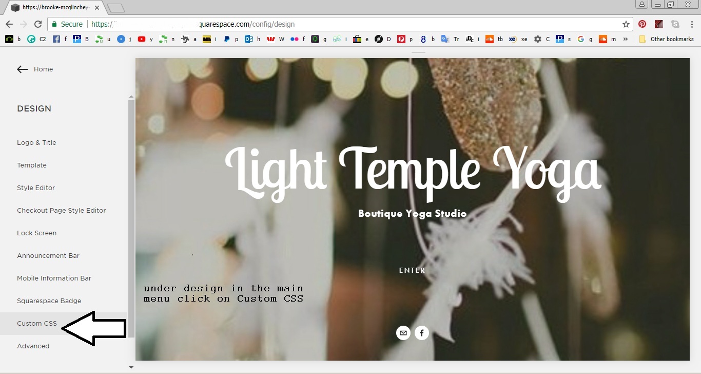
Now in our squarespace dashboard we find DESIGN and under this ‘Custom CSS’ -click on this:
4. Adding the styling {border:1px black;}
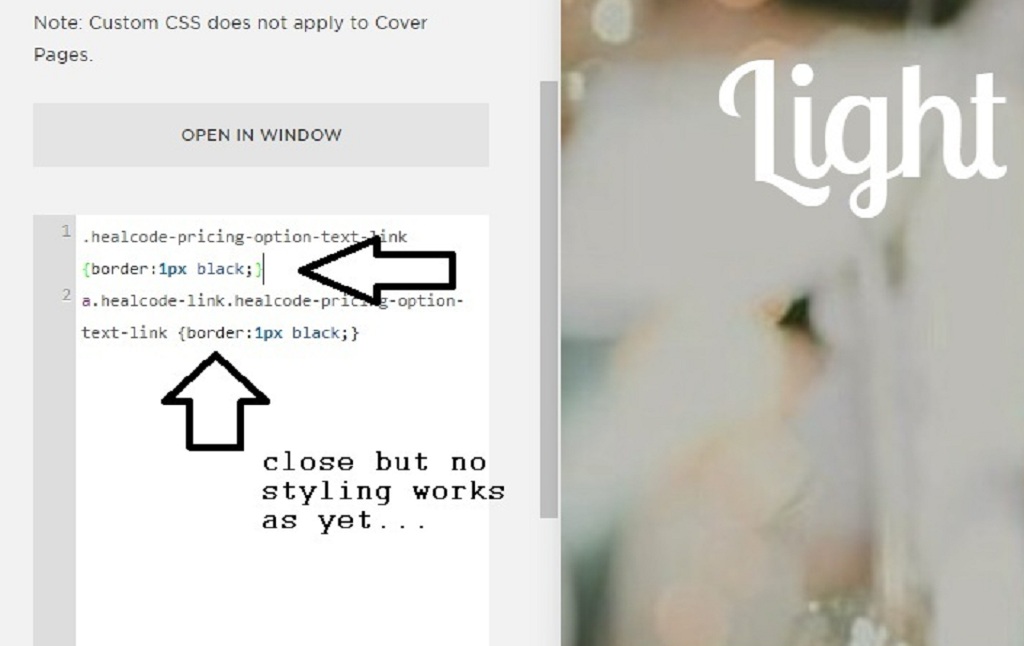
**for more info on the border style please check w3 schools**
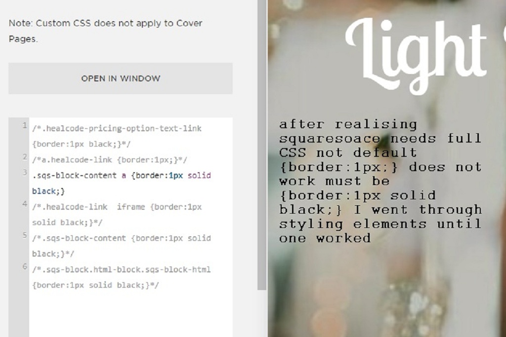
5. Squarespace needs full css border property
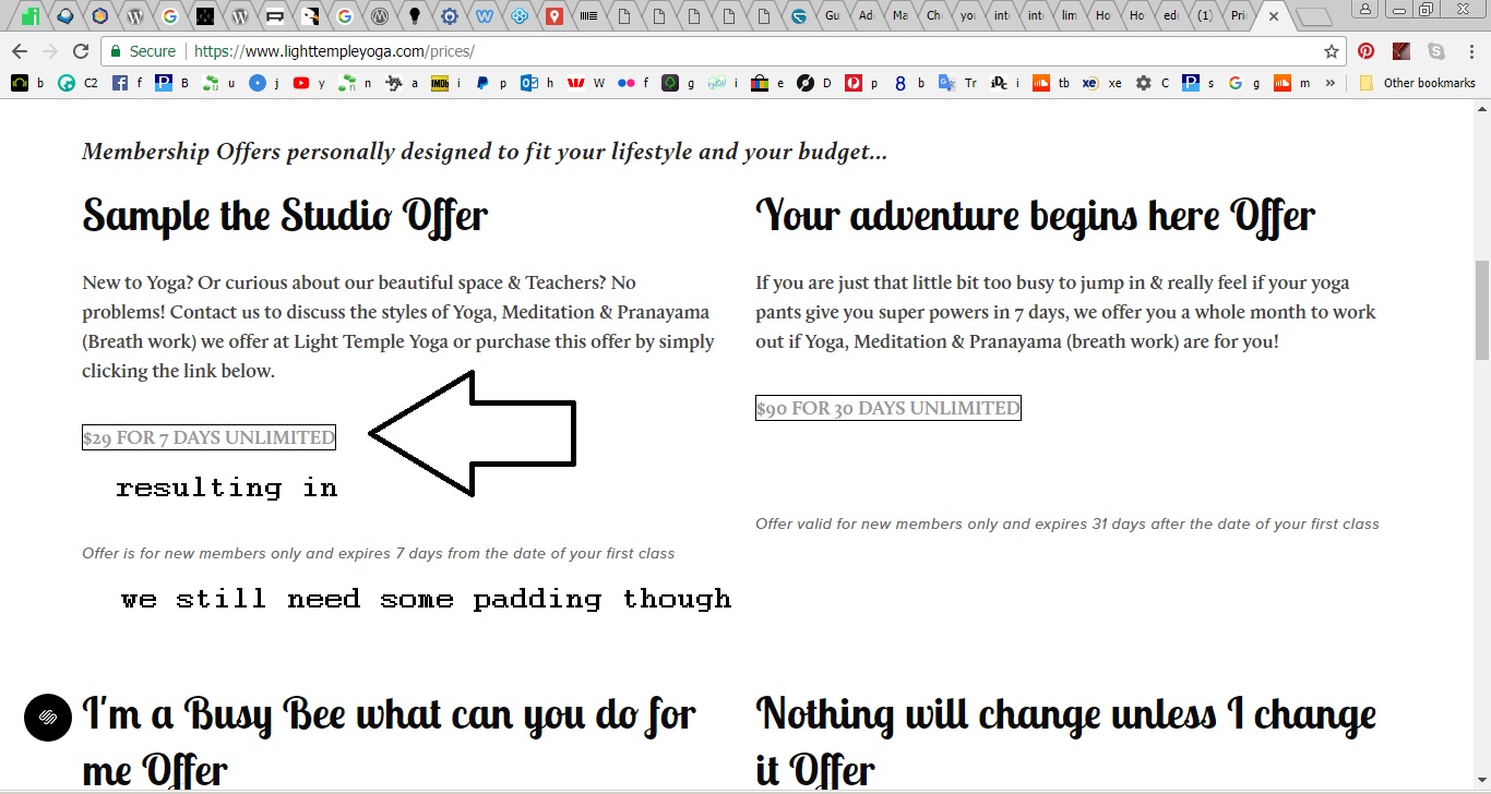
After realising squarespace needs full css border property {border:1px solid black;} not partial {border:1px black;} (and also too that i was trying to style a dynamically loaded element -the price div) – I managed to figure the element to style .sqs-block-content a {border:1px solid black;}-which worked.
6. The Border was too close
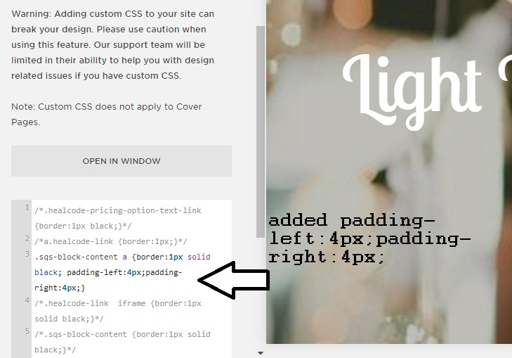
The Border was too close to the text so I added padding:4px left and right: .sqs-block-content a {border:1px solid black;padding-left:4px;padding-right:4px;}

Hope this helps!

